The VIX gets called the "fear index," and the instinct is simple: when it spikes, get out. We wanted to know whether the data actually rewards that instinct — so we pulled every VIX close since 1993 and lined it up against what the S&P 500 did over the next 21 trading days (about a month). That's more than 8,400 days of evidence, and here is what it says:
Three decades of fear, on one chart
First, the raw material. The VIX spends most of its life in the teens, punctuated by spikes that look apocalyptic in the moment — 2008, 2020, and a dozen smaller panics between:
What the next month actually looked like
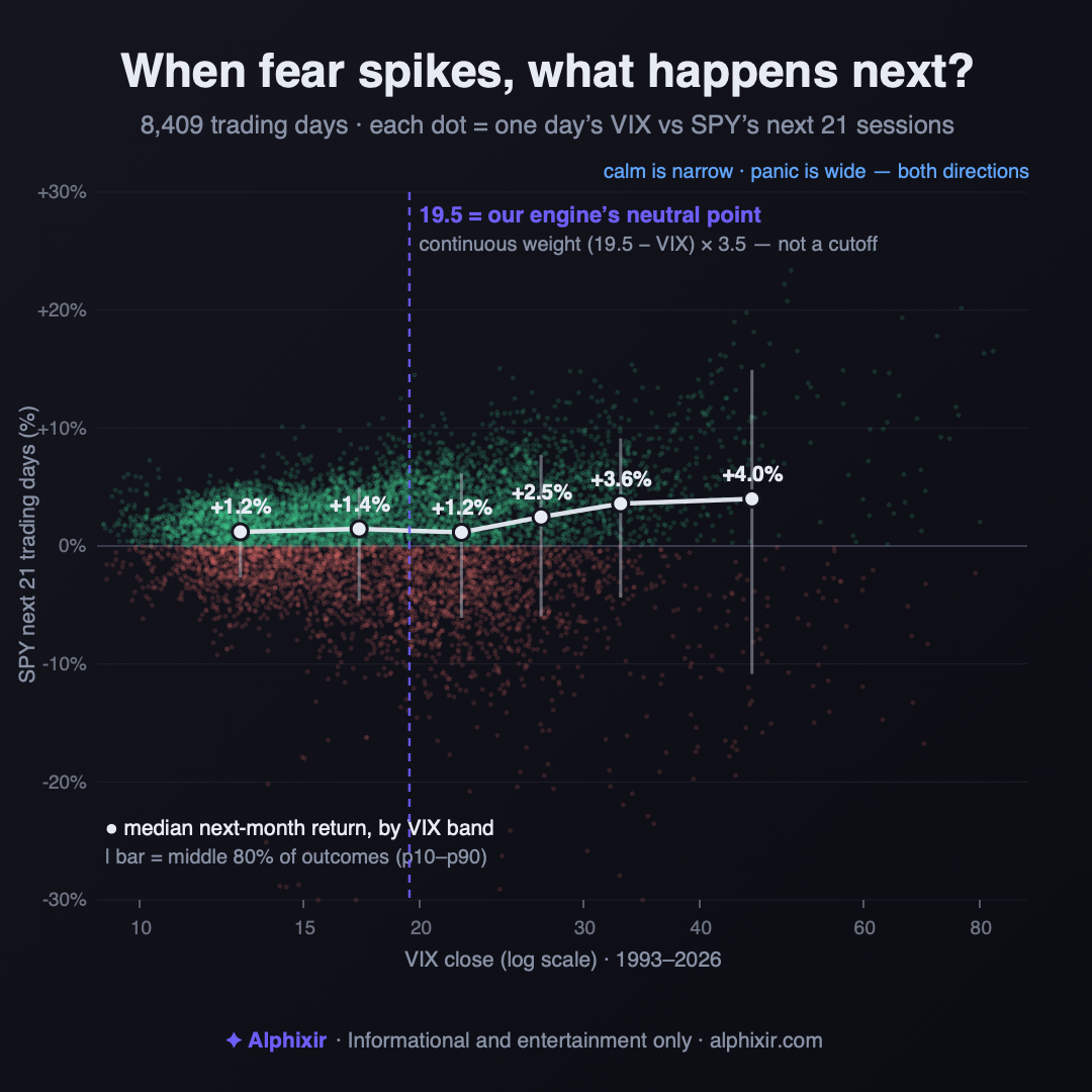
Now the part that surprises people. Sorting all 8,400+ days into fear bands, the median return over the next 21 sessions actually rises with fear: with the VIX under 15, the next month returned about +1.2% at the median; in the 20s, roughly +1.2% to +2.5%; and at 40 or above — full-panic territory — about +4.0%. On average, buying calm has paid less than buying fear.
But the median is only half the story, and the other half is the whole point. As fear rises, the range of outcomes explodes in both directions — the whiskers in the chart above. Calm markets are narrow: nine out of ten calm-market months landed inside a band about six points wide. Panic markets are wide open: at VIX 40+, the same nine-of-ten band spans roughly 26 points — from double-digit further losses to double-digit rebounds. The single worst forward month in the 40+ band lost about 19%; the best gained about 25%. High fear doesn't reliably mean "up next." It means "less predictable next, with the odds tilted higher." Those are very different claims, and conflating them is how people get hurt.
| VIX band | Days | Median next 21 sessions | 10th pct | 90th pct | Positive |
|---|---|---|---|---|---|
| <15 | 2,797 | +1.2% | -2.7% | +3.8% | 68% |
| 15–20 | 2,429 | +1.4% | -4.6% | +5.0% | 66% |
| 20–25 | 1,675 | +1.2% | -6.1% | +6.2% | 60% |
| 25–30 | 804 | +2.5% | -5.9% | +7.7% | 66% |
| 30–40 | 497 | +3.6% | -4.4% | +9.1% | 75% |
| 40+ | 208 | +4.0% | -10.9% | +14.9% | 63% |
Why our engine refuses to draw a line in the sand
This is exactly why our regime engine refuses to treat the VIX as a binary switch. A cutoff — "sell above 30, buy below" — throws away everything in the charts above. It can't tell the difference between a VIX of 31 and a VIX of 65, and it flips your entire posture on a single tick across an arbitrary line.
Instead, the engine reads the VIX as a continuous weight, centered on a neutral point of 19.5: the contribution is (19.5 − VIX) × 3.5, clamped at the extremes. Below 19.5, the signal leans slightly constructive; above it, progressively cautious — and a 40 pushes far harder than a 25, in proportion to how unusual it is. No line in the sand, no all-or-nothing flip. It's one input among several the engine blends before it decides how much to risk on a given morning.
None of this is a prediction. A high VIX has preceded both sharp recoveries and deeper falls, and the next spike will resolve however it resolves. What the history supports is a posture, not a forecast: when fear is high, size to the widening range rather than to the scary headline. That's the read behind the number — and, like everything our engine does, it's shown, not asserted.
1. Across 8,400+ days, higher fear has meant a higher median forward month — +1.2% below VIX 15 vs. about +4% above 40. The panic-selling instinct runs against the base rate.
2. But high fear also means a range of outcomes roughly four times wider, in both directions. "Tilted higher" and "reliably higher" are different claims.
3. That's why a continuous weight beats a cutoff: size to the widening range, don't flip on an arbitrary line. A pattern, not a prediction.
Informational and entertainment content only. Not investment advice. VIX history from FRED (VIXCLS); S&P 500 forward returns computed from SPY adjusted-close data since 1993. Past patterns are not predictions.